| PMC full text: | Published online 2024 Nov 16. doi: 10.1186/s40168-024-01962-2
|
Fig. 4

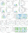
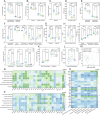
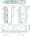
Analysis of white cell composition and their transcriptome in calves. A Venn diagram showing shared and unique genes among different time points. Principal component analysis plots of the mapped genes (B), assessed indicators in routine blood test (RBT) (J), and measured serum indicators (R), respectively. Volcano plots representing differentially expressed genes (DEGs) at 3 time points: A vs B (C), B vs C (E), and A vs C (G). Bubble charts detailing the KEGG pathways significantly enriched by DEGs at 3 time points: A vs B (D), B vs C (F), and A vs C (H). I Venn diagram of the shared and unique DEGs identified across all comparisons. Heatmaps of Spearman’s rank correlations between respiratory health indicators and growth performance with RBT indicators at time point A (K), as well as with considered serum indicators at time point A (S). L–Q Boxplots of selected serum indicators with significant differences across time points. In B, J, and R, the analysis of similarities algorithm was employed to analyze the differences among groups. In C, E, and G, upregulated genes are denoted by green dots and downregulated genes by blue dots, with significance determined by adjusted p <
< 0.05 and |log2 (fold change)|≥
 1. In D, F, and H, the ratio of genes enriched in a pathway to the total number of genes in that pathway is indicated by numbers next to the bubbles; bubble size represents the count of enriched genes, and color indicates significance levels based on adjusted p values. In K and S, correlations were calculated using clinical data from the 10 marked calves; pane colors denote the strength and direction of relevance (green for positive, blue for negative), and asterisks indicate significance levels of relevance (*, p
 <
< 0.05; **, p
 <
< 0.01; ***, p
 <
< 0.001). In L–Q, the yellow dot denotes average values, and one-way analysis of variance was used to assess difference levels among groups (ns, non-significant; *, p
 <
< 0.05; **, p
 <
< 0.01; ***, p
 <
< 0.001)


