| PMC full text: | Published online 2024 Nov 16. doi: 10.1186/s40168-024-01962-2
|
Fig. 5

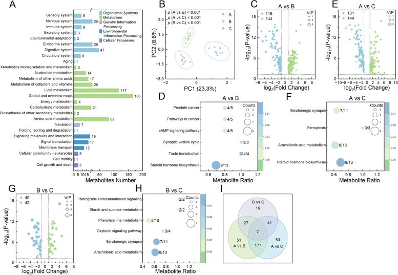
Analysis of serum metabolomic profiling in calves. A Bar chart representing the KEGG pathways into which the identified metabolites were categorized, with the number of metabolites for each pathway displayed alongside the corresponding bars. B Principal component analysis plot of the metabolites identified in each sample group. Volcano plots illustrating differentially expressed metabolites at different time points: A vs B (C), A vs C (E), and B vs C (G). Bubble charts detailing the KEGG pathways significantly enriched by differentially expressed metabolites at 3 time points: A vs B (D), B vs C (F), and A vs C (H). I Venn diagram of the shared and unique differentially expressed metabolites identified across all comparisons. In C, E, and G, upregulated metabolites are indicated by green dots and downregulated metabolites by blue dots; dot sizes denote the variable importance in the projection (VIP) values, with significance determined by adjusted p <
< 0.05, |log2 (fold change)|≥
 1, and VIP
 >
> 1. In D, F, and H, the ratio of metabolites enriched in a pathway to the total number of metabolites in that pathway is indicated by numbers adjacent to the bubbles; bubble size represents the count of enriched metabolites, and color indicates the significance levels based on adjusted p values


