| PMC full text: | Vaccine. Author manuscript; available in PMC 2023 Sep 29. Published in final edited form as: Vaccine. 2022 Sep 29; 40(41): 5912–5923. Published online 2022 Sep 5. doi: 10.1016/j.vaccine.2022.08.055 |
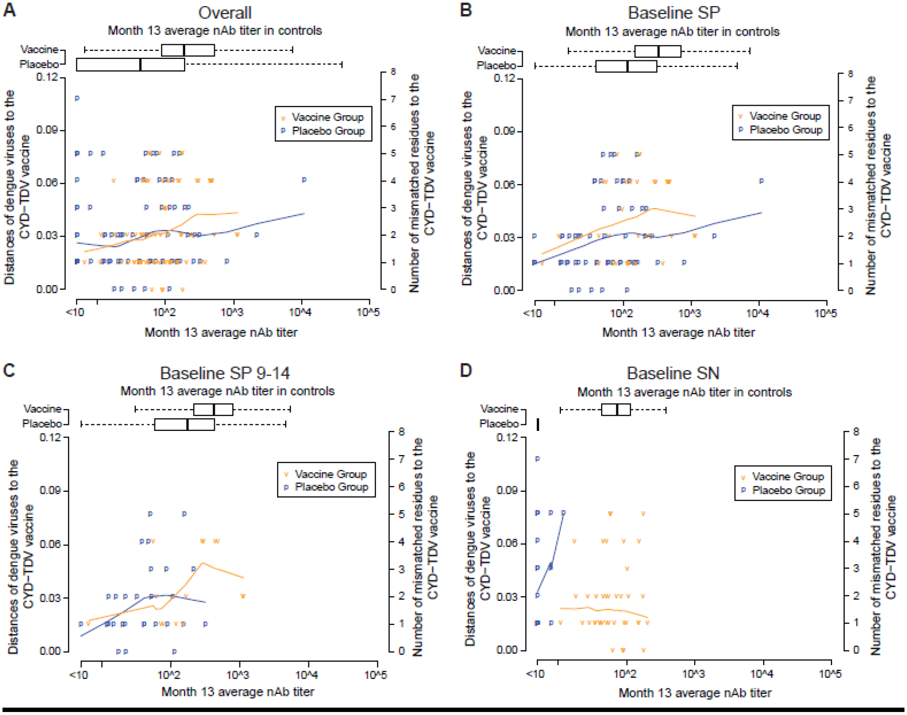
Figure 6.

Scatterplots of nAb contact site distances vs. Month 13 average nAb titer by treatment group.
Scatterplots are shown for the following cohorts: (A) Overall, (B) Baseline SP, (C) Baseline SP 9–14, and (D) Baseline SN. nAb contact site distances were averaged over the 20 multiply imputed data sets. The blue and orange lines in each panel are lowess locally-weighted polynomial regression smooth fits to the scatterplot using the R function lowess with default value of the smoother span set to 2/3.


