| PMC full text: | Neuroimage. Author manuscript; available in PMC 2023 Jul 1. Published in final edited form as: Neuroimage. 2023 Jul 1; 274: 120120. Published online 2023 Apr 16. doi: 10.1016/j.neuroimage.2023.120120
|
Fig. 1.

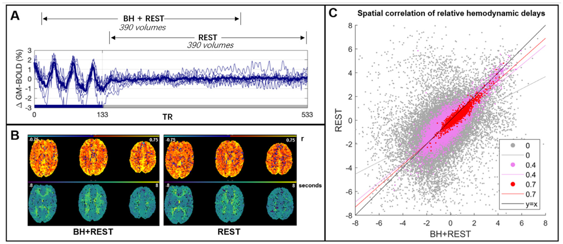
Panel A: The BOLD time-series averaged across gray matter (GM) for each subject (thinner blue lines) and the group average (thicker line). This time-series data was cut into two segments: one segment, BH+REST, includes a breathing task (solid blue bar on x-axis) followed by REST; the second segment is only REST. 390 vol amount to 7 min 48 s (TR=1.2 s). Panel B: The output maps, from Rapidtide, for one example subject. The top row shows the correlation amplitude at each voxel (maximum correlation coefficient between each voxel time-series and probe regressor). The bottom row shows the relative delays at each voxel (time in seconds when the maximum correlation occurred). Panel C: Spatial correlation, in GM voxels, between hemodynamic delay times (panel B, bottom) from the BH+REST and REST data segments of an example subject. The correlation amplitude (panel B, top) is used to threshold the delays; the figure legend shows 3 examples of amplitude thresholding we applied. Each dot represents a voxel passing the threshold for both data segments, e.g., 0 = hemodynamic delay for a specific voxel must be in GM and have a correlation amplitude greater than 0 to be included. The lines are linear regression lines. For comparison, the y = x line is also shown.


