| PMC full text: | Published online 2018 Oct 10. doi: 10.1038/s41586-018-0579-z
|
Fig. 4
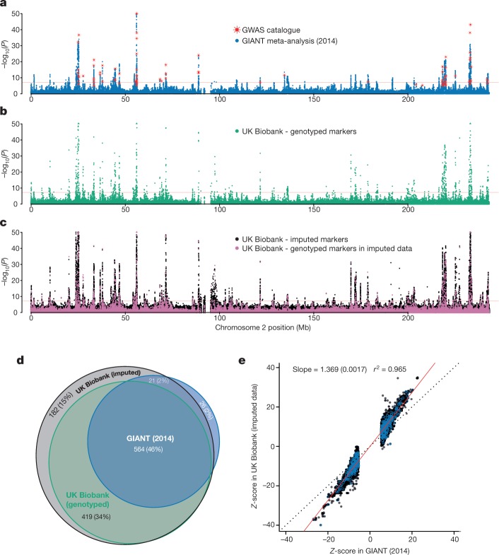
Results (P values) of association tests between human height and genotypes using three different sets of data for chromosome 2. In a–c, P values are shown on the −log10 scale, capped at 50 for visual clarity and uncorrected for multiple comparisons. Markers with −log10(P) > 50 are plotted at 50 on the y axis and shown as triangles rather than dots. Horizontal red lines denote P =
= 5
5 ×
× 10−8. a, Results for published meta-analysis by GIANT32 (n
 =
= 253,288), with NCBI GWAS catalogue markers superimposed in red (plotted at the reported P values). b, Association statistics (from linear mixed model, see Methods) for UK Biobank markers in the genotype data (n
 =
= 343,321). c, Association statistics (from linear mixed model, see Methods) for UK Biobank markers in the imputed data (n
 =
= 343,321). Points coloured pink indicate genotyped markers that were used in pre-phasing and imputation. This means that most of the data at each of these markers comes from the genotyping assay. Black points (the vast majority, ~8 million) indicate fully imputed markers. d, Venn diagram of the results of counting the number of 1-Mb windows with at least one locus with P
 <
< 5
5 ×
× 10−8 in the GIANT, UK Biobank genotyped and UK Biobank imputed datasets (see Methods). Percentages in brackets are the proportion of the union of such windows across all three data sources (1,215). There were only three windows contained in UK Biobank genotyped data and not the imputed data. e, Comparison of Z-scores in UK Biobank (y axis) and GIANT (x axis). Z-scores were calculated as effect size divided by standard error, but only for markers with P
 <
< 5
5 ×
× 10−8 in GIANT, for a set of 575 associated regions, which we also used for the credible set analysis (see Methods). The marker with the smallest P value (in GIANT) within each region is highlighted with blue circles. The black dotted line shows x
 =
= y, and the red solid line shows the linear regression line estimated on these data. The standard error of the regression coefficient is shown in brackets. Pearson’s correlation was used to calculate the r2 value.
