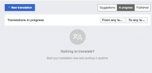
Currently the language selector component becomes wider as there is more space available:
This results in a control that becomes too wide for no reason. The following adjustments are proposed instead:
- Make the component grow to accommodate the language labels with some padding (8px vertical, and 16px horizontal).
- Set a maximum width for the component not to take more then one third of the available space, and make the language labels to be cropped with ellipsis for the exceptionally long cases.
- Remove the chevron.
- Use base90 (#f8f9fa) as background color.
The resulting component should look closer to the example below:


