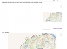
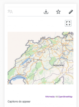
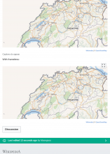
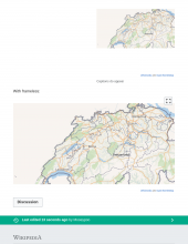
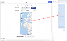
If a mapframe has a width of 100% set, it will fail to display anything (except the caption) on the mobile site. However, if "frameless" is used the map will display correctly. Examples.
Description
Details
Related Objects
Event Timeline
The CSS rule that seems to be causing this is:
@media (max-width: 720px) {
    .content .thumb .thumbinner {
        display: flex;
        /* other flex properties */
    }
}
Probably was meant to apply to images, not maps.
I can't reproduce it in master, I don't have display:flex applying to this class. @Catrope do you know where is this coming from?
I do see this in enwiki, but when I override it with display:block; it looks mangled (it does display, but halfway through). It's hard to debug without reproducing, though. Is this some gadget or extension I'm not using locally? Can we trace its origin? I can't find where it's coming from.
I see it in MinervaNeue in resources/skins.minerva.content.styles/hacks.less :
// Hacks to render galleries and multicol tables better on mobile
@media all and ( max-width: @width-breakpoint-tablet ) {
	.content {
/* stuff... */
		// Deal with Template:Multiple_image.  T38030 and T148505
		.thumb .thumbinner {
			.flex-display( flex );
			justify-content: center;
			flex-wrap: wrap;
			align-content: flex-start;

			> .thumbcaption {
				.flex( 1, 0, 100% );
				display: block;
			}
		}
	}
}
But even thought I've enabled mobileFrontend on my vagrant, pulled recent master from both MobileFrontend and skins/MinervaNeue, and added $wgMFAutodetectMobileView = true; just in case to my LocalSettings.php the styles aren't loading for me locally.
@Jdlrobson Do you have any idea what I'm doing wrong? Minerva is available for me in vagrant when I force it (?useskin=minerva) and still it isn't loading the above style, but also MobileFrontend doesn't seem to trigger for the chrome emulator like it did before.
Am I forgetting some variable? Did I not load something?
Got it. I had to add $wgMinervaApplyKnownTemplateHacks = true; to my LocalSettings.php
Meh. I'm going to override the styles in Kartographer, but @Jdlrobson I'm now a little concerned that maps aren't the only exception to the rule that the hacks are overriding. You might get issues with other multimedia embeds that are inside "thumbinner", so the rule in MinervaNeue might benefit from being, maybe, a little more specific to the actual Template:Multiple_image it's trying to fix?
Change 435774 had a related patch set uploaded (by Mooeypoo; owner: Mooeypoo):
[mediawiki/extensions/Kartographer@master] Override MinervaNeue Multiple_image hack for map display
@Jdlrobson I'm now a little concerned that maps aren't the only exception to the rule that the hacks are overriding.
It seems unfortunate that .content .thumb .thumbinner is matching a map. A map is not a thumbnail.
Is there anyway we can change the class names in this situation? I'm not sure how the Minerva rule could be more specific other than using a not selector.
Change 435774 merged by jenkins-bot:
[mediawiki/extensions/Kartographer@master] Override MinervaNeue Multiple_image hack for map display
Checked in betalabs - the maps with width="100%" will be displayed, so the fix is there.
However @Mooeypoo, I need your feedback on the following:
(1) MinervaNeue will display width="100%" (without frameless) and width="100%"(with frameless) differently.
The first map does not seem to be 100% width:
(2) Possible regression in the layout:
Using code from https://commons.wikimedia.org/wiki/User:Gareth/maps/test3 (it was modified for a location available on betalabs).
Mapframes with a width of 100% fail to display on the mobile site unless "frameless" is used
<mapframe width="100%" height="400" latitude="47" longitude="7.5" zoom="8" text="Captions do appear" />

{{-}}
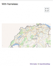
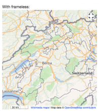
With frameless:
<mapframe width="100%" height="400" latitude="47" longitude="7.5" zoom="8" frameless />
MinervaNeue (and Chrome mobile emulator) show:
In commons (wmf.6) the same code for frameless will be displayed differently:
But .thumb isn't just used for images at all across mediawiki; anything from videos to graphs to maps use it, as it's more a "placement" or "design/style" than an actual "thumbnail".
@Jdlrobson Honestly, I think the better solution here would be that the specific fixes in MinervaNeue are done for more specific CSS rules for the relevant images that break in the template given. I'm not 100% sure if using flexbox is not going against some older browsers we're supporting for the reading experience but I assume you know better on that front than I do :)
In any case, I'll go over the regression and see how to fix it for enwiki, but I think rather than having maps (and graphs, and videos, and 3d art, etc etc) that use .thumb override the MinervaNeue styles, minerva should use more specific CSS styles.
would be that the specific fixes in MinervaNeue are done for more specific CSS rules for the relevant images that break in the template given.
@Mooeypoo did you have a certain CSS rules in mind? The rule was added to address captions (see T150706) but I'm not sure how it could be generalised given captions are associated with all thumbs that I know of.
I'm not sure, I can look into this and see if I find any creative solutions -- but if this is for a very specific template on English Wiki, can we edit the template to add a class? That would definitely be the best and quickest solution....
@Etonkovidova this is odd; I have checked this in beta, and I see both maps as 100% until I resize the width to about 710+. When it's over that, the top map is not 100%, but the bottom one is.
But mobile view for mobile phone displays both as 100% without problem.
Can you verify?
I'm checking into that anyways. I think it's probably an issue with the responsive rules.
Found the culprit rule.
MinervaNeue/resources/skins.minerva.tablet.styles/common.less has this rule:
@media screen and ( min-width: @width-breakpoint-tablet ) {
	// ...
	.content {
		// Classes added by thumbnails
		// e.g. [[File:Scholars mate animation.gif|frame|left|"[[Scholar's mate]]"]]
		// We use @noflip because we still want .tleft to be on the left and
		// .tright to be on the right in RTL languages.
		figure,
		.thumb {
			width: 320px;
			// ...
		}
	}
}
I'll override that, but once again, @Jdlrobson, that rule is probably not just affecting maps; thumbs with width=100%, I imagine, will all be affected... ?
Change 437515 had a related patch set uploaded (by Mooeypoo; owner: Mooeypoo):
[mediawiki/extensions/Kartographer@master] Fix thumb with full width in MinervaNeue
@Mooeypoo I'm back in the office Monday. Maybe we can take an hour to go through this and work out a sustainable way forward? I need to re-familiarize myself with the original bug report as well as the problem here.
Change 437515 merged by jenkins-bot:
[mediawiki/extensions/Kartographer@master] Fix thumb with full width in MinervaNeue
The following issues are out of scope of this particular issue. I can file any of the following as a separate issues.
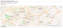
(1) The difference in displaying dynamic and static maps for the following:
== 100% map - frameless -full ==
Testing https://phabricator.wikimedia.org/T192251
Mapframes with a width of 100% fail to display on the mobile site unless "frameless" is used
With 100% only
<mapframe width="100%" height="400" latitude="40.325" longitude="-3.7172" text="Captions do appear" align="right" />

With frameless:
<mapframe width="100%" height="400" latitude="40.325" longitude="-3.7172" frameless />
<div style= "clear:both;"> </div>
Width=full
<mapframe width="full" height="400" latitude="40.325" longitude="-3.7172" text="width=full" />
Static maps with the above code - https://test.wikipedia.org/wiki/Mavetuna
Dynamic maps with the above code - https://test2.wikipedia.org/wiki/Mavetuna22
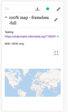
(2) The difference in displaying dynamic maps between MinervaNeue (and https://test2.m.wikipedia.org/wiki/Mavetuna22) and Vector (Vector skin screenshot is in the example above):
MinervaNeue display:
(3) Static maps on mobile devices (and Chrome mobile emulator) have their own shortcomings:
(4) switching to VE.
Static maps - https://test.wikipedia.org/wiki/Mavetuna:
- width=100% is displayed only partially and when you start editing, the map are not presented correctly:
Dynamic maps will display the same shortcomings as static maps.
(5) frameless maps cannot be edited in VE and there is not warning about it.
Closing the issue as Resolved - the fix to the original issue has been deployed to wmf.8. Mapframe with width=100% (and without frameless) will be displayed correctly on mobile.
The above issues might be triaged and priortized after the scope of maps adaptation would be defined better.
