Page MenuHomePhabricator

Email address option in Preferences should not use red box
Closed, ResolvedPublic

Description

Author: mailstorpk

Even when it's unconfirmed, the user's email address in preferences (which is optional) should not be given in a red box, which generally indicates an error message. The information about your e-mail address not being confirmed should probably be changed to display as a warning rather than error

Screenshot of the email options in preferences:
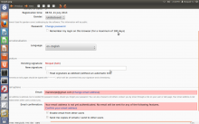
rpk.png (900×1 px, 279 KB)

Event Timeline

bzimport raised the priority of this task from to Low.Nov 22 2014, 2:40 AM
bzimport set Reference to bz56611.

The Email conformation box is ok to be in red, but the email input box need not be.

The classes which set those colors are .mw-email-not-authenticated and
.mw-email-none.

This will probably require some simple, but careful adjustments in their definitions in mediawiki.special.preferences.css and/or where they're added to the page in Preferences.php.

mailstorpk wrote:

I plan to work on this bug. Kindly do assign me this bug.

mailstorpk wrote:

Changed the red boxed email and email confirmation options

In MW preferences, email and email confirmation options were given in red boxes indicating error message.In this attachment the red color is removed and the outline color is also changed from red.

attachment patchcss.diff ignored as obsolete

mailstorpk wrote:

Changed the red boxed email and email confirmation options

In MW preferences, email and email confirmation options were given in red boxes
indicating error message.In this attachment the red color is removed and the
outline color is also changed from red.
//The last patch was incomplete.

attachment patchnew.diff ignored as obsolete

Change 93981 had a related patch set uploaded by Gerrit Patch Uploader:
Changed the red boxed email and email confirmation options

https://gerrit.wikimedia.org/r/93981

mailstorpk wrote:

Changed the red boxed email and email confirmation options

In MW preferences, email and email confirmation options were given in red boxes
indicating error message.In this attachment the red color is removed and the
outline color is also changed from red.

Attached:

Please upload updated patches to Gerrit if possible. Please see http://www.mediawiki.org/wiki/Gerrit/Tutorial for how to do so.
We do not use Bugzilla to review patches at all.

Change 94117 had a related patch set uploaded by Gerrit Patch Uploader:
Changed the red boxed email and email confirmation options

https://gerrit.wikimedia.org/r/94117

The second box (Email conformation section) is display when its half done (email entered but not confirmed) so it should probably still be countered as a error and displayed as such.

Change 93981 abandoned by Bartosz Dziewoński:
Changed the red boxed email and email confirmation options

Reason:
Superseded by https://gerrit.wikimedia.org/r/94117 . You should submit new patchsets to existing changesets instead of new ones.

https://gerrit.wikimedia.org/r/93981

mailstorpk wrote:

p858snake: I have considered your suggestion and submitted my new patch.

I'm not really convinced red (actually pinkish) is bad here.

This is only for non-authenticated emails. We *want* to catch their attention. They lose important functionality, including password reset, if they don't confirm their email.

CCing Jared for UX feedback.

Actually, if I'm reading the code right, you don't need to confirm your email for password reset.

However, if it's not confirmed, you might have mistyped it, in which case you still effectively won't be able to reset.

Can someone upload a screenshot of the proposed change, rather than just the code changed.

mailstorpk wrote:

Screenshot of proposed change

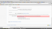
Screenshot of the proposed change that shows that only email not authenticated option should be highlighted red as an error.

Attached:

Screenshot_from_2014-01-18_17:56:00.png (768×1 px, 104 KB)

I'm fine with this change, but the one thing we lose is the correlation between the "error" and the email associated with it. Can we change the text to

"Your email address, $emailaddress is not yet confirmed. You will not receive email notification until you confirm this address."

Small correction

"Your email address, $emailaddress is not yet confirmed. You will not receive
email notifications until you confirm this address."

@matmarex: Reading through the comments of this task, this task should probably first receive an updated description explaining what exactly is expected from a contributor, before making this available in GCI: Whether both boxes should not be red (and what else instead), whether text changes are also expected (see T58611#643768).

@matmarex: Looks like a student could could pick up https://gerrit.wikimedia.org/r/#/c/94117/ and improve it?

I think it'll be easier to start from scratch. That patch makes a few questionable changes with no explanation (which is why it wasn't accepted). It can still be useful for reference, though.

@matmarex: Reading through the comments of this task, this task should probably first receive an updated description explaining what exactly is expected from a contributor, before making this available in GCI: Whether both boxes should not be red (and what else instead), whether text changes are also expected (see T58611#643768).

All that's required is to make the unconfirmed email address not appear in a red box. The other should be changed to display as a warning rather than error, but it's fine either way. Jared's suggestion from T58611#643768 was incorrect (this controls more than just notifications), I don't think any localisation changes are needed.

matmarex renamed this task from Email and Email confirmation options in Preferences should not use red boxes . to Email address option in Preferences should not use red box.Dec 6 2015, 7:54 PM
matmarex updated the task description. (Show Details)

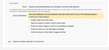
Is it a good idea to change email confirmation field to warning rather than error using yellow color like on the screenshot? Should I use some specific colors (in hex) for that?

Screen Shot 2015-12-11 at 17.12.50.png (430×932 px, 78 KB)

Orange is the color of warning. It conveys to the user their action may fail or have serious consequence but are not destructive. Some examples could be that an edit is likely to encounter an automated block due to the nature of the content, or that a preference is being reset to a default options.

Yes, it seems appropriate, there is a serious consequence involved here: the lack of possibility of password reminder, and so the risk to lose account, so yes, that could be a warning.

Change 258917 had a related patch set uploaded (by Neonowy):
Special:Preferences Remove red box in email and changed confirm error to warning

https://gerrit.wikimedia.org/r/258917

Change 258917 merged by jenkins-bot:
Special:Preferences Remove red box in email and changed confirm error to warning

https://gerrit.wikimedia.org/r/258917

matmarex assigned this task to Neonowy.
matmarex removed a project: Patch-For-Review.