Page MenuHomePhabricator

[GOAL] Accessibility settings/preferences on desktop and mobile
Closed, DuplicatePublic

Assigned To
Authored By
Nirzar
Mar 1 2015, 6:39 PM
Referenced Files
F36372984: Screen Shot 2023-01-20 at 1.40.02 PM.png
Jan 20 2023, 9:40 PM
F36372982: Screen Shot 2023-01-20 at 1.39.45 PM.png
Jan 20 2023, 9:40 PM
F3140697: Screen Capture on 2015-12-23 at 20-13-29.gif
Dec 24 2015, 1:34 AM
F2614037: Screen Shot 2015-09-16 at 23.18.09.png
Sep 18 2015, 12:02 AM
F168938: mediumText.svg
May 25 2015, 10:12 AM
F168937: uniE040 - largeText.svg
May 25 2015, 10:12 AM
F168939: smallText.svg
May 25 2015, 10:12 AM
F168931: smallText.svg
May 25 2015, 10:06 AM
Tokens
"Mountain of Wealth" token, awarded by Sj."Love" token, awarded by alexhollender_WMF."Love" token, awarded by Demian."Like" token, awarded by Liuxinyu970226."Like" token, awarded by Rdicerb."Like" token, awarded by Fhocutt."Love" token, awarded by Florian."Like" token, awarded by Prtksxna."Like" token, awarded by Quiddity.

Description

GOAL
Offer a satisfying user-interface experience to as many people as possible.

We have been striving for a one-size-fits-all interface. In contrast this solution offers users with very common disabilities and impairments, which we know the current interface doesn't offer best experience, an easy way to adapt the interface to their needs and to serve them the best we could.

  • What DONE looks like **
  • Mobile and desktop have a unified control for changing font size.
  • Special:MobileOptions is only shown to logged in users

What to offer
We’re talking about flexibility in changing basic settings (still to clarify needs, define and test) like

  • font size,
  • day/night modes,
  • photophobia,
  • grayscale,

For whom
For all readers including not-logged-in ones.
Technical limitation to support it for every user is, that it has to be implemented client-side in JavaScript to avoid cache fragmentation.

Where and how
Some early mockups:

And more recently discussed “reader“ settings (design and location) over at https://www.mediawiki.org/wiki/Beta_Features/Hovercards/preferences
Related is question to consolidate important reader preferences (appearance, language, accessibility preferences) into one location, which is also a good part of the discussion on the Hovercards preferences.

Separation to other accessibility improvements
In general, with WMF's vision of ”every single human being”, we try to provide broadest-possible support. But with given technical constraints we need to balance the different needs. At T111117 there are for example tasks collected, that can be baked-in per default into our software products, others like above mentioned font-size, day-night modes etc. are better built as preferences and decided on a per-user base, as there's not one solution fits all.


Relevant discussion on: T72879: Simple accessibility preferences
Version: 1.24rc

Related Objects

StatusSubtypeAssignedTask
DuplicateFlorian
DuplicateJdlrobson
DuplicateNone
DuplicateNone
OpenFeatureNone
OpenNone
DuplicateNone
ResolvedKrinkle
ResolvedJdlrobson
DuplicateJdlrobson
ResolvedJScherer-WMF
Resolvedovasileva
ResolvedNBaca-WMF
ResolvedEdtadros
ResolvedDesignJScherer-WMF
ResolvedJScherer-WMF
ResolvedNone
Resolvedovasileva
Resolvedovasileva
ResolvedNone
ResolvedSpikeJdrewniak
Resolvedbwang
Resolvedovasileva
ResolvedBUG REPORTJdlrobson
Resolvedovasileva
ResolvedDTorsani-WMF
Resolvedovasileva
Resolvedovasileva
Resolvedovasileva
ResolvedJdlrobson
Resolvedovasileva
Declinedovasileva
Resolvedovasileva
Resolvedovasileva
Resolvedovasileva
DuplicateNone
DuplicateBUG REPORTJdlrobson
Resolvedovasileva

Event Timeline

There are a very large number of changes, so older changes are hidden. Show Older Changes

T234703: Skin Minerva Neue: do not manually assign fonts highlighted a need to allow users to change the font used to the system default. Some OSes - most notably mobiles - have an option to select a custom system-wide font, that's the closest to the user's expectations.

I'd also add the option to use a modern webfont (Noto Sans - Noto Serif being a candidate as the font supporting the most languages). That would make 3 choices: Font: Skin's font / Noto (webfont) / System default font

Additionally, I'd add a choice between sans-serif and serif fonts, which is usually a subjective choice, that greatly affects the user experience. The system default font depends on this choice. This setting also enables the use of both the sans-serif and the serif font stacks.

Details: T244748: Add client-side skin preferences drop-down

Jdlrobson renamed this task from Accessibility settings/preferences to [EPIC] Accessibility settings/preferences.Jun 1 2021, 7:16 PM
Jdlrobson added a project: Epic.

Other than font size, font type should also be cutomizable, for people with different needs

For Wikipeda like Chinese and Japanese Wikipeda, different text orientation option should also be available as these languages can be written in multiple orientations, and some might be more accustomed to one than the other.

There are some wrong design decissions that are against accesibility. For example, hiding the login button inside a menu, instead of showing it from the beginning: T289212

I would like to know how a person with visual impairments will know where the log-in button is. I asked that months ago, there's a ticket open, but no answer from the design team.

Change 881932 had a related patch set uploaded (by Jdlrobson; author: Jdlrobson):

[mediawiki/skins/Vector@master] Proof of concept: Show case possibilities in client side preferences dropdown

https://gerrit.wikimedia.org/r/881932

Test wiki created on Patch demo by Jdlrobson using patch(es) linked to this task:
https://patchdemo.wmflabs.org/wikis/a522674b0f/w

We think we've found a way to do this with some constraints. Chatting on Monday about whether the approach there is viable from performance perspective.

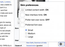
I've built a prototype if anyone is lurking here in case it's useful for community conversation https://patchdemo.wmflabs.org/wikis/a522674b0f/wiki/Mahatma_Gandhi?useskin=vector-2022
Replaces the fixed width toggle with a fully blown menu that works for anons:

Screen Shot 2023-01-20 at 1.39.45 PM.png (140×282 px, 3 KB)

Screen Shot 2023-01-20 at 1.40.02 PM.png (754×1 px, 175 KB)

I'm really happy this is being looked at again! Thank you.

In case it helps (and as it's easily missed), I want to mention that the "Mock Description" and comments sections at M17 contain a lot more details/ideas/references.

For non-logged-in users (via cookie?) - remember line width/ToC position (show/hide)/etc. (as many preferences as possible - almost everything a logged-in user has, including choosing "vector 2010", etc.) - both a set-by-user "global" setting and set-by-user "specific page exception" settings

Article editors should be able to select "server-side" default for each article - line width/ToC position, and users (including non-logged-in) should be able to select globally/per article whether to follow the Editor/server-side suggestion or not.

History article appears in the vector 2022 format on my browser now (non-logged user). I opened it when reading it's an exception (https://www.mediawiki.org/wiki/Reading/Web/Desktop_Improvements/Features/Limiting_content_width#Constraints) - and it really appeared as vector 2010, but after fiddling with the toggle and other settings on other pages - now even History appears as vector 2010?

If there are any concerns with the line width toggle position, overlap with content, user confusion if it doesn't do anything on small screen, etc. - just put it in any of the collapsible menus at sandwich/three-dots/footer/etc. Important is to be possible to trigger it at ANY resolution by ANY user.

Line width toggle - even when expanded leaves more space on the right than in vector 2010. Can we have an "extra wide" mode where content occupies even more of the space (same as vector 2010 or even till the window border)? Or even user selectable length. Similarly, on the left side in vector 2022 there is blank space between ToC/service menu and article - can its size become user-selectable as well?

I would show the line width toggle always, regardless of window width - but on smaller than some threshold (1400px per T326887 ?) - the toggle should ALSO hide the ToC menu.

Always having the option for expanded line width is the best, so I'm glad adding it permanently in a menu is being worked upon.
Much more important than the specific threshold (and toggling together with ToC) is for both settings to STICK for all articles for non-logged-in users. Currently having to click on every page refresh/open is getting annoying fast. So, I hope that's considered here.

Background colors and widths to be user-selectable for each of the vector 2022 spaces:

Test wiki created on Patch demo by Jdlrobson using patch(es) linked to this task:
https://patchdemo.wmflabs.org/wikis/5512c1ca5b/w

Test wiki on Patch demo by Jdlrobson using patch(es) linked to this task was deleted:

https://patchdemo.wmflabs.org/wikis/5512c1ca5b/w/

Test wiki created on Patch demo by Jdlrobson using patch(es) linked to this task:
https://patchdemo.wmflabs.org/wikis/cb775d9677/w

Test wiki on Patch demo by Jdlrobson using patch(es) linked to this task was deleted:

https://patchdemo.wmflabs.org/wikis/cb775d9677/w/

Test wiki created on Patch demo by Jdlrobson using patch(es) linked to this task:
https://patchdemo.wmflabs.org/wikis/10b47eaaa5/w

@Quiddity not thinking about design right now but thanks for the mock!
@Anteraf we have to be careful about how many different variants we support, so I don't think we'll be able to cater for such exact fine tuning, but hopefully we land on some preferences that make sense. Thanks for the feedback here, I'll definitely pass it on to my peers as we talk through this.

@Mooeypoo so now we have a solution for fixed width I've been battle testing this against other types of preferences including one close to your heart.. dark mode.
You can check it out here: https://patchdemo.wmflabs.org/wikis/10b47eaaa5/wiki/Space?useskin=vector-2022 (click the cog in the bottom right)

I think this solution of building on top of what we have with https://gerrit.wikimedia.org/r/c/mediawiki/core/+/883243 is very viable, but obviously we should explore others (I can't think of any right now). How do you recommend we proceed with working out the long term solution?

Test wiki created on Patch demo by Jdlrobson using patch(es) linked to this task:
https://patchdemo.wmflabs.org/wikis/1165364832/w

Change 881932 abandoned by Jdlrobson:

[mediawiki/skins/Vector@master] Proof of concept: Show case possibilities in client side preferences dropdown

Reason:

Needs rebasing against current implementation. I may restore at some later point if this is useful.

https://gerrit.wikimedia.org/r/881932

Jdlrobson added a subscriber: Mabualruz.

I'll take over driving this epic so that Mo now that we have finished the TDMP process and introduced the mw.user.clientPref API.

I'll take over driving this epic so that Mo now that we have finished the TDMP process and introduced the mw.user.clientPref API.

@Jdlrobson - the main tracking epic is T341631: [EPIC] Q1 Main hypothesis: Typographical and palette customizations. I think it might make the most sense to close this one.

Jdlrobson renamed this task from [EPIC] Accessibility settings/preferences to [GOAL] Accessibility settings/preferences on desktop and mobile.Sep 21 2023, 5:50 PM
Jdlrobson updated the task description. (Show Details)

Test wiki on Patch demo by Jdlrobson using patch(es) linked to this task was deleted:

https://patchdemo.wmflabs.org/wikis/a522674b0f/w/

Test wiki on Patch demo by Jdlrobson using patch(es) linked to this task was deleted:

https://patchdemo.wmflabs.org/wikis/10b47eaaa5/w/

Test wiki on Patch demo by Jdlrobson using patch(es) linked to this task was deleted:

https://patchdemo.wmflabs.org/wikis/1165364832/w/